[Site Top] | Demography (in Japanese) | [in Japanese]
Latest update on 28th August 2019
The purpose of this page is to explain how to easily make population pyramid using free software. Basically I explain it in Windows environment, but the all free softwares used here can run on not only Windows but also Mac OS X and Linux, so that the explanation may be applicable to Mac and Linux environment, too.
The following 3 softwares are needed.
You may use your own data based on hand-made census or aggregated data provided by government or other official institutions. Nonetheless, the data needed to make population pyramid is always sex-and-age specific population.
First of all, I explain how to make population pyramid for already aggregated official statistics of Japan, using the function pyramid() or pyramids().
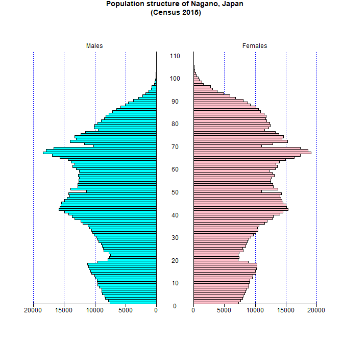
You need the sex/age class-specific population, the periods of age-classes, and axis information (if axis is not specified, automatically calculated from maximum value). After downloading the file from e-Stat or other web site, you have to make the text file extracted those information from original file. For that purpose, one of the easy ways is described below, using an example of Nagno prefecture Japan.
x<-read.delim("e:/work/nagano-table-2015.csv")x<-read.delim("http://minato.sip21c.org/demography/nagano-table-2015.csv")pyramids(Left=x[,2], Right=x[,3], Center=x[,1], Cstep=10)
If you just want to make the population pyramid, that's all. If you need more sophisticated graph, you can use LibreOffice Draw to edit it by the following process.
Without additional editing, it is possible to make a nicelook pyramid only using R with pyramid package. For example, type as follows (nagano-pyramid-2015.R).
# x <- read.delim("http://minato.sip21c.org/demography/nagano-table-2015.csv")
x <- read.delim("./nagano-table-2015.csv")
library(pyramid)
png("nagano-pyramid-2015-en.png", width=672, height=672)
par(family="sans", mar=c(2,3,2,2))
pyramid(data.frame(M=x[,2], F=x[,3], A=x[,1]),
 Clab="", Llab="Males", Rlab="Females", Cstep=10, AxisFM="d",
 main="Population structure of Nagano, Japan\n (Census 2015)")
dev.off()
Then, you can get the following graph.
Next, I will explain how to make population pyramid from the raw data of small scale population census.
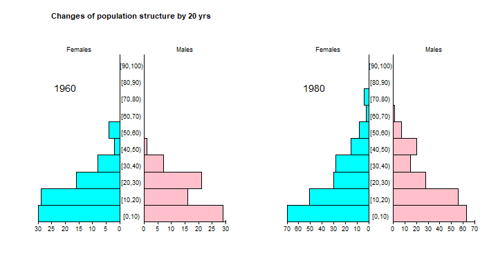
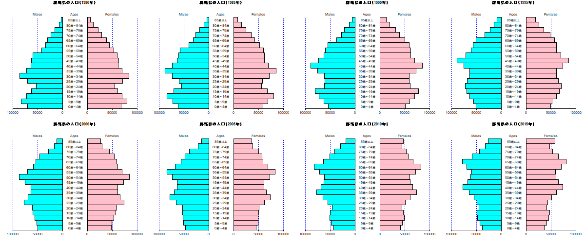
Above example showed to draw 2 population pyramids within a single device, here let's see how to draw 8 population pyramids of Gunma prefecture, Japan from 1980 to 2015 by every 5 years. The Excel file, da03.xls can be downloaded from e-Stat. This excel file contains each prefecture in seperated worksheet, in which 10th sheet is for Gunma prefecture. Of course, LibreOffice Calc can read the Excel-format file, so that you can manually open da03.xls by Calc and delete unnecessary rows and columns (you also need to delete commas, and to replace "-" by 0) and save as text file and read it from R. However, easier way is using read_xls() function included in readxl package developed by Dr. Hadley Wickham and others.
In the worksheet, row 7 is "0-4 years old", row 24 is "85 years old and older", columns E and F are males and females in 1920, columns L and M are males and females in 1925. Columns CK, CL, CR, CS, CY, CZ, DF, DG, DM, DN, DT, DU, EA, EB, EH, and EI are males and females in 1980 to 2015. By properly specifying the options sheet=¡¤range=¡¤col_names=¡¤col_types=, read_xls() function can read the data with selecting ranges and formats.
In my understanding, read_xls() function cannot directly read the file via internet, you have to put the downloaded da03.xls in your working directory.
I don't explain the coding in detail, but when you run gunmapyramids.R on R, you may find the graph below in PNG format.
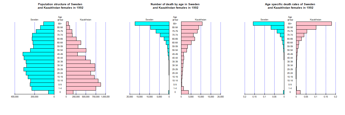
As written above, in the population pyramid graph, usually age-specific population structure of males and females of the one population are drawn left and right with opposite direction. However, it's also possible to align 2 different populations (or age-specific number of deaths) in left and right to compare those 2 populations.
For instance, let's see the example in Preston SH et al. (2001) Demography. Blackwell Pub. p.22. That compares the age-specific population and death of females in 1992 in Sweden and Kazakhstan.
| Age Group | Population in Sweden | Death in Sweden | Population in Kazakhstan | Death in Kazakhstan |
|---|---|---|---|---|
| 0 | 59727 | 279 | 174078 | 3720 |
| 1-4 | 229775 | 42 | 754758 | 1220 |
| 5-9 | 245172 | 31 | 879129 | 396 |
| 10-14 | 240110 | 33 | 808510 | 298 |
| 15-19 | 264957 | 61 | 720161 | 561 |
| 20-24 | 287176 | 87 | 622988 | 673 |
| 25-29 | 311111 | 98 | 733057 | 752 |
| 30-34 | 280991 | 140 | 732312 | 965 |
| 35-39 | 286899 | 197 | 612825 | 1113 |
| 40-44 | 308238 | 362 | 487996 | 1405 |
| 45-49 | 320172 | 643 | 284799 | 1226 |
| 50-54 | 242230 | 738 | 503608 | 2878 |
| 55-59 | 210785 | 972 | 301879 | 3266 |
| 60-64 | 216058 | 1640 | 374317 | 5212 |
| 65-69 | 224479 | 2752 | 256247 | 6866 |
| 70-74 | 222578 | 4509 | 154623 | 6182 |
| 75-79 | 184102 | 6745 | 149917 | 8199 |
| 80-84 | 140667 | 9587 | 88716 | 9013 |
| 85+ | 110242 | 17340 | 58940 | 10627 |
The tab-delimited text file of this table is deaths.txt. You can read this data and draw population, number of deaths, and age-specific mortality of Sweden at left panel and Kazakhstan at right panel, respectively, using comp2pop.R. The graph is drawn in a file with PNG format as below.
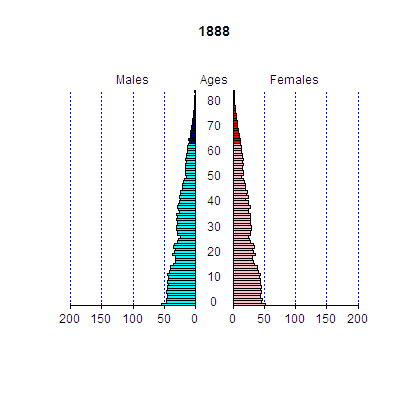
The fmsb package (another package I developed and registered in CRAN) includes the data frames Jpop and Jpopl, extracted from Japan's population census (In Jpop, highest open-ended age-class is 85+ and in Jpopl, it is 110+). Variables are Age (caution! Not integer but factor, because open-ended age is given by "85+" or "110+") in the first column, and M1888 to F2015 from the second column to end (those variables are composed of the first character indicating sex of M/F and the following 4 digits indicating year). If you use those data frames, the national population pyramids in Japan for all years when national population cenus has ever been conductd can be drawn easily. National population in Japan is so large that numbers shown in axis is too large. I recommend that devide the populations by 10000 and give notation in title as "(Unit: 10,000)".
The options in pyramid() to specify colors to fill the bars, Lcol and Rcol for left and right respectively, can be given as vector. By doing so, bars of specific age-classes can be filled by different colors.
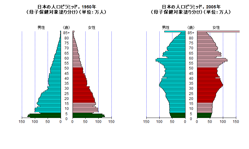
Enhancing the ages of the targets of Maternal and Child Health by different colors, then align 2 population pyramids of just after WWII and recent by the code of pyramid2mch.R. You may get the graph below.
To make animation GIF, Giam can be used to integrate png files which is made by R.
for () loop can be used to automatically make population pyramids of all years. To give titles including variable years, sprintf() function is useful. The code make-all-pyramids-japan.R includes the process of reading data and automatically making png files of population pyramids for all years (When you execute this code on R, many png files are automatically generated in the working directory).
Run Giam, select [File] menu and [Insert scenes]. Then, select all png files and click [OK]. There are many options, but I only changed waiting time from 10/100 sec to 20/100 sec, then save as GIF. You may find the file below.
Nonetheless, it's much better to use animation package now. Please see the presentation at Japanese R users meeting in 2012 (in Japanese)
As I wrote in my journal on 4th September 2014 (in Japanese), I made and added a new function pyramidf() to draw population pyramid within a specified frame. This function is almost samely used as pyramid(), but new option "frame=" is added to specify the bottom left and top right coodinates by the following order c(left-x, right-x, bottom-y, top-y). The default value set is frame=c(-1.15, 1.15, -0.05, 1.1), which is same as given by pyramid(data.frame, Cgap=0.3, ...). You can see an example of 2 population pyramids of Gunma prefecture, Japan (in 2005 and 2010) overlayed by typing library(pyramid); example(pyramidf).
(Note: the explanation below is not sophisticated. I should revise it only to use R packages, without EpiInfo. Please suggest me how to do it.)
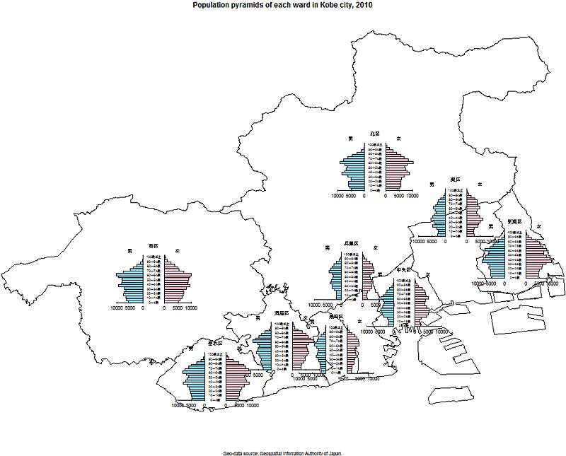
The R code kobe-plot.R is to overlay population pyramids of each ward on the map of Kobe city. It's somewhat complicated. You have to install maptools package. Then, you have to download the shape file of Hyogo prefecture as N03-140401_28_GML.zip from the web site of GIS homepage (probably chiiki_hani.zip from Kobe city's web site, or Japan' shapefile from ESRI Japan are also available, but I don't know how to use those for this purpose).
In the case of N03-140401_28_GML.zip, after extraction of all files from the zip archive, you may use EpiMap software (included in Free software EpiInfo for windows provided by CDC) to read the shape file and use AddLayerPartial function to limit the area to Kobe city, then save the geographic information as kobe-city.shp.
In the same directory with the shape file, you may place population census data by ward in Kobe city in 2010, which has been obtained from the census result page of Kobe city, then manually edited and saved as tab-delimited text file. Then you may place this code in the same directory and specify working directory there by setwd(), then type source("./kobe-plot.R"). You may find the map below (the map is saved as low resolution raster graphics, thus I think the special permission from MLIT is unnecessary).
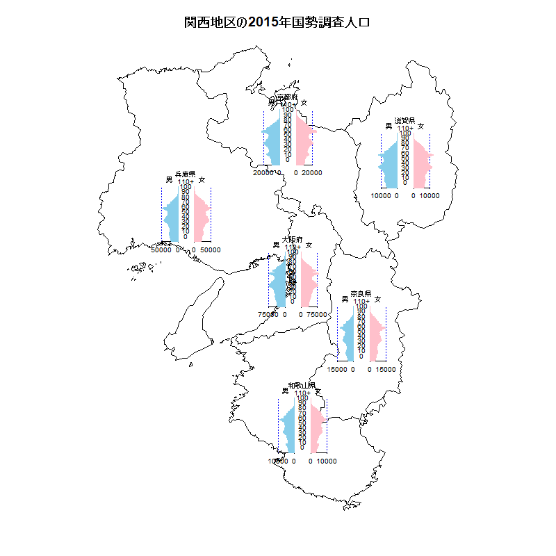
The mapdata package (available from CRAN) includes prefecture-level geographic information for Japan. Therefore, when you prepare each prefecture's sex/age-specific population data, overlay prefecture-specific population pyramids on the map of Kansai area is relatively easy, by this code (Note: it includes Japanese characters, so that you may need to specify appropriate code page). Of course, you have to install.packages("mapdata", dep=TRUE) in advance.
From the excel-data of prefecture-specific population estimates for every 5 year age-groups (explained above) and Japan's map data on mapdata package ("japan"), it's possible to overlay the prefecture-specific population pyramids on the map of Japan. However, when I draw the population pyramids of all 47 prefectures, it's too ugly, and thus I draw only 4 prefectures' population pyramids of Aomori, Tokyo, Nagano and Okinawa. In addition, the data include census-based population in 2015 and projected populations by every 5 years until 2045, so that I will show the change of the shapes of population pyramids as animation.
When you use animation package, you have to pay attention to several points. At first, the size of picture has to be specified by ani.options() function. Second, if you would like to make mp4 movie file, you may use saveVideo() function, when you need to install ffmpeg in advance and give the full path as an option in saveVideo() function. Third, and most important, only the graph drawing whole screen with setting axes can be recorded in animation.
Therefore, if you first draw map by map("japan") and insert prefecture-specific population pyramids by pyramidf() funtion followed by short-time pause by ani.pause(), and if, except for population pyramid in 2045, fill the pyramid by white rectangle by rect() and draw next population pyramid, only the last graph (map with 4 pyramids in 2045) is recorded in animation file.
Thus, you have to repeat the whole process of drawing the map and overlaying each pyramid within the animation recording function such as saveGIF() or saveVideo().
This code gives the drawing below (MP4 movie is also available).
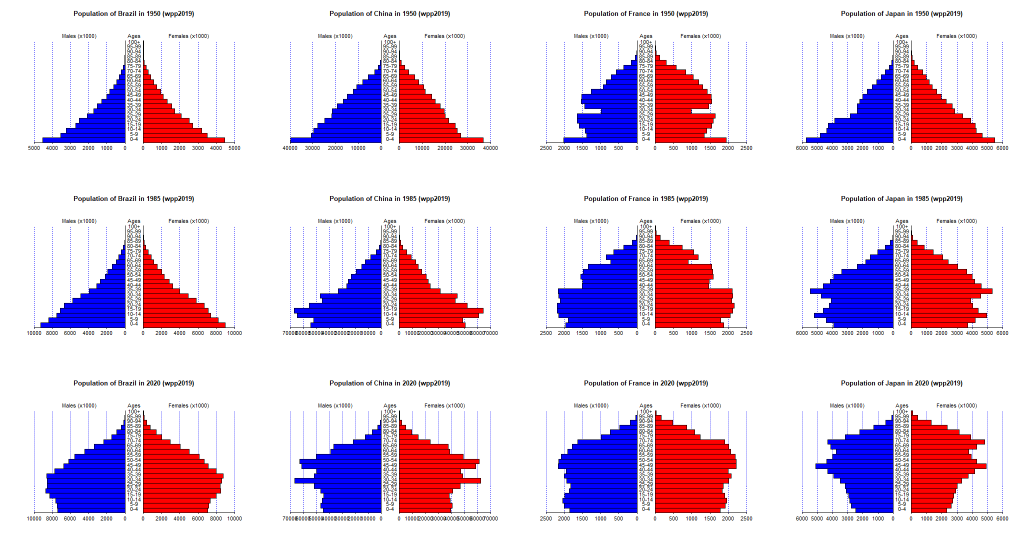
As noted in my journal, the data in 2019 of World Population Prospects is already compiled as the package "wpp2019", which is already available from CRAN. Thus I wrote the R code to select country/region and year from wpp2019 and draw population pyramid.
As the next step, I enabled multiple selection (Ctrl+click) of countries/regions and years (1950 to 2020) from wpp2019 by this code. At first, automatic setting of axis was ugly, but Ura (back side) RjpWiki taught me of the function pretty() (this entry by hoxo_m is excellent information about pretty()), I changed the algorithm for auto-set of axis in pyramid() from simple same-width division into 5 parts to pretty()'s setting. Of course, when you manually specify the axis by Laxis= (and Raxis=), you can still give axis as you set. pyramid_1.5.zip or pyramid_1.5.tar.gz can be downloaded from this site, or you can install it from CRAN.
I give an example of the population pyramids of Brazil, China, France, Japan in 1950, 1985, 2020.
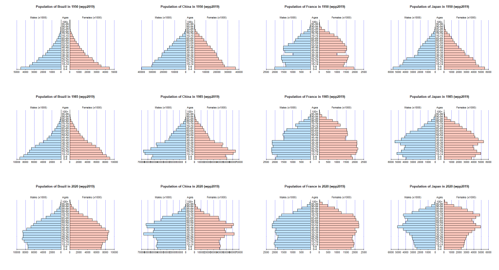
In addition, after the registration of version 1.5 of pyramid package to CRAN, Prof. Okumura in Mie Univ. taught me of the color of statistical graphs. Prof. Okumura suggested that the default color of graphs should be selected from base-colors of universal design. I didn't pay much attention to default colors (actullay the color of grid line is fixed as "blue", unchangeable), but I agree with the suggestion by Prof. Okumura, so that I will incorporate the change of default color setting and more flexible color settings in version 1.6. As base color of universal design, males should be filled by #bfe4ff" and females by "#ffcabf". I made the same graph as mentioned above with these color settings by this code. The graph is generated as shown below.
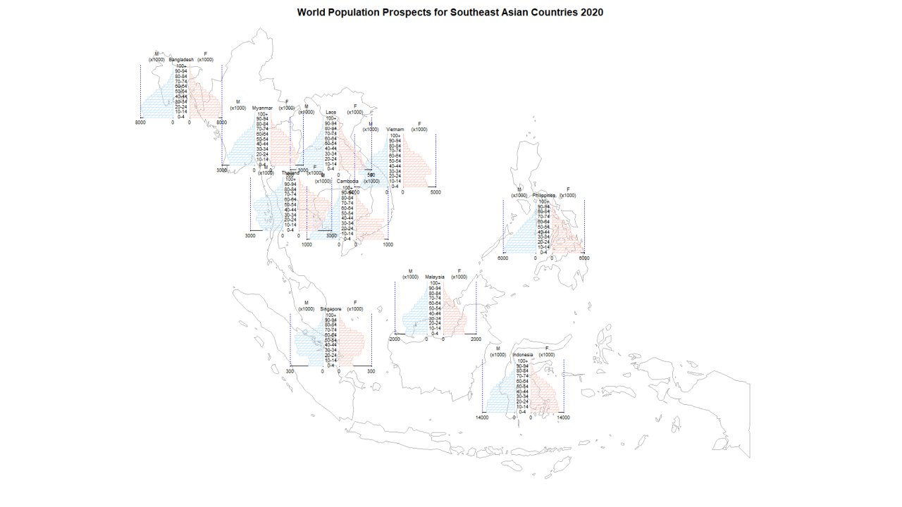
Combination of mapdata package, wpp2019 package, and the frame version population pyramid of pyramid package enables to overlay population pyramids on the world map without external shapefile nor population data.
Possible problems may involve the differences of countries/regions name between mapdata package and wpp2019 package. For instance, Vietnam is given the name of "Vietnam" in mapdata package, but "Viet Nam" in wpp2019 package. When you make R code, you have to pay attention to such difference. Except this, algorithm is relatively simple. The code to overlay the population pyramids on the map of South-East Asian countries gives the figure below.
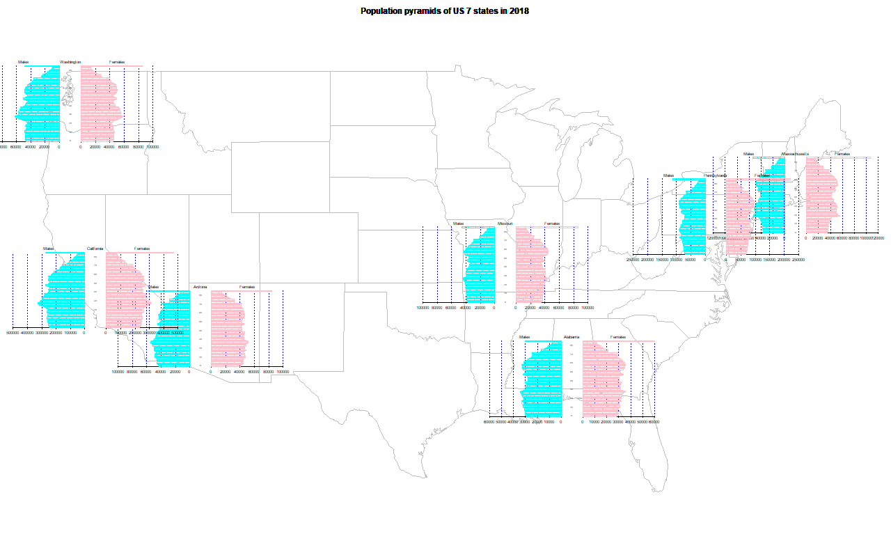
US states map is included in the maps package. Sex/age-specific data for each state of USA (CSV format) in US Census Bureau can be read by read.csv() function of R. Therefore, you can easily combine those. By running us-states.R, you can get the graph below.
Correspondence to: minato-nakazawa[atmark]umin.net.